Organizing Data Graphical and Tabular Descriptive Techniques презентация
Содержание
- 2. Learning Objectives Overall: To give students a basic understanding of best
- 3. Descriptive statistics involves arranging, summarizing, and presenting a set of data
- 4. DATA MINING Most companies routinely collect data – at the cash
- 5. DATA MINING is a collection of methods for obtaining useful knowledge
- 6. 1. Marketing and sales: companies have lots of information about past
- 7. Finance: Mining of financial data can be useful in forming and
- 8. Statistical methods, such as hypothesis testing, are helpful as part of
- 9. 3. Product design: What particular combinations of features are customers ordering
- 10. 4. Production 4. Production Imagine a factory running 24/7
- 11. 5. Fraud detections: 5. Fraud detections: Fraud can affect many
- 12. YOU once received a telephone call from your credit card company
- 13. Data mining is a large task that involves combining resources from
- 14. Statistics: All of the basic activities of statistics are involved: a
- 15. Some specialized statistical methods are particularly useful, including classification analysis (also
- 16. Computer science: Efficient algorithms (computer instructions) are needed for collecting, maintaining,
- 17. Optimization: Optimization: These methods help you achieve a goal, which might
- 18. Alternatively, the goal might be more vague such as obtaining a
- 19. WHAT IS PROBABILITY? Probability is a what if tool for understanding
- 20. You might learn, for example, that an international project has only
- 21. Here are additional examples of situations where finding the appropriate answer
- 22. 3. What are the chances that a foreign country (where you
- 23. Probability is the inverse of statistics. Whereas statistics helps you go
- 24. Probability also works together with statistics by providing a solid foundation
- 26. Definitions… A variable [Typically called a “random” variable since we do
- 27. We Deal with “2” Types of Data Numerical/Quantitative Data [Real Numbers]:
- 28. Quantitative/Numerical Data… Quantitative Data is further broken down into Continuous Data
- 29. Qualitative/Categorical Data Nominal Data [has no natural order to the values].
- 30. Graphical & Tabular Techniques for Nominal Data… The only allowable calculation
- 31. Nominal Data (Tabular Summary) -
- 32. Nominal Data (Frequency)
- 33. Nominal Data (Relative Frequency)
- 34. Frequency Distributions Definition A frequency distribution for qualitative data lists all
- 35. Example 2.2 A sample of 30 employees from large companies was
- 36. Example 2.2
- 37. Solution 2.2
- 38. Relative Frequency and Percentage Distributions Calculating Relative Frequency of a Category
- 39. Relative Frequency and Percentage Distributions cont. Calculating Percentage Percentage =
- 40. Example 2.3 Determine the relative frequency and percentage for the data
- 41. Solution 2-2
- 42. Graphical Presentation of Qualitative Data Definition A graph made of bars
- 43. Figure 2.2 Bar graph for the frequency distribution of Table 2.3
- 44. Graphical Presentation of Qualitative Data cont. Definition A circle divided into
- 45. Table 2.4 Calculating Angle Sizes for the Pie Chart
- 46. Figure 2.4 Pie chart for the percentage distribution of Table 2.5.
- 47. ORGANIZING AND GRAPHING QUANTITATIVE DATA Frequency Distributions Constructing Frequency Distribution Tables
- 48. Frequency Distributions
- 49. Frequency Distributions cont. Definition A frequency distribution for quantitative data
- 50. Essential Question : How do we construct a frequency distribution table?
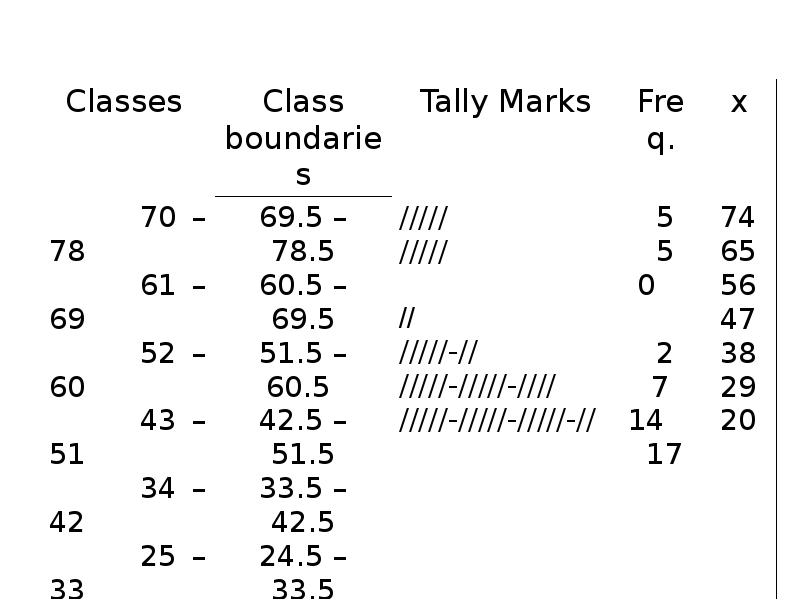
- 51. Process of Constructing a Frequency Table STEP 1: Determine the
- 52. STEP 2. Determine the tentative number of classes (k) STEP 2.
- 53. STEP 3. Find the class width by dividing the range by
- 54. STEP 4. Write the classes or categories starting with the lowest
- 55. STEP 5. Determine the frequency for each class by referring to
- 56. When constructing frequency tables, the following guidelines should be followed. The
- 57. 3. All classes should have the same width, although it is
- 58. Let’s Try!!! Time magazine collected information on all 464 people who
- 59. 19 18 30 40 41 33 73 25 19 18 30
- 60. Determine the range. Determine the range. R = Highest Value –
- 61. Determine the tentative number of classes (K). Determine the tentative number
- 62. Find the class width (c). Find the class width (c). *
- 63. Write the classes starting with lowest score.
- 64. Using Table: Using Table: What is the lower class limit of
- 66. Example Table 2.9 gives the total home runs hit by
- 67. Table 2.9 Home Runs Hit by Major League Baseball Teams During
- 68. Solution 2-3
- 69. Solution 2-3 The lower limit of the first class can be
- 70. Table 2.10 Frequency Distribution for the Data of Table 2.9
- 71. Relative Frequency and Percentage Distributions Relative Frequency and Percentage Distributions
- 72. Example 2-4 Calculate the relative frequencies and percentages for Table 2.10
- 73. Solution 2-4
- 74. Graphing Grouped Data Definition A histogram is a graph in which
- 75. Figure 2.3 Frequency histogram for Table 2.10.
- 76. Figure 2.4 Relative frequency histogram for Table 2.10.
- 77. Graphing Grouped Data cont. Definition A graph formed by joining the
- 78. Figure 2.5 Frequency polygon for Table 2.10.
- 79. Figure 2.6 Frequency Distribution curve
- 80. Example 2-5 The following data give the average travel time from
- 81. Example 2-5
- 82. Solution 2-5
- 83. Solution 2-5
- 84. Example 2-6 The administration in a large city wanted to
- 85. Solution 2-6
- 86. Figure 2.7 Bar graph for Table 2.13.
- 87. Ogive The ogive is a graph that represents the cumulative frequencies
- 88. Ogive
- 89. Patterns of Scatter Diagrams… Linearity and Direction are two concepts we
- 90. Скачать презентацию


 are needed for collecting, maintaining,")


![We Deal with “2” Types of Data
Numerical/Quantitative Data [Real Numbers]:](/documents_7/c03e86ff40eb5eefeded565b0f71141a/img26.jpg "We Deal with “2” Types of Data
Numerical/Quantitative Data [Real Numbers]:")

![Qualitative/Categorical Data
Nominal Data [has no natural order to the values].](/documents_7/c03e86ff40eb5eefeded565b0f71141a/img28.jpg "Qualitative/Categorical Data
Nominal Data [has no natural order to the values].")

 -")
")
")


STEP 2.")


.
Determine the tentative number")
.
Find the class width (c).
*")


Слайды и текст этой презентации
Слайд 1
Описание слайда:
Organizing Data Graphical and Tabular
Descriptive Techniques
Numerical/Quantitative Data
Qualitative/Categorical Data
Graphical Presentation of Qualitative Data
Organizing and Graphing Quantitative Data
Frequency Distributions
Process of Constructing a Frequency Table
Graphing Grouped Data
Ogive
Stem-аnd-Leaf Displays
Слайд 2
Описание слайда:
Learning Objectives
Overall: To give students a basic understanding of best way of presentation of data
Specific: Students will be able to
Understand Types of data
Draw Tables
Draw Graphs
Make Frequency distribution………….
Слайд 3
Описание слайда:
Descriptive statistics involves arranging, summarizing, and presenting a set of data in such a way that useful information is produced.
Descriptive statistics involves arranging, summarizing, and presenting a set of data in such a way that useful information is produced.
Descriptive statistics make use of graphical techniques and numerical techniques (such as averages) to summarize and present the data.
Слайд 4
Описание слайда:
DATA MINING
Most companies routinely collect data – at the cash register for each purchase, on the factory floor from each step of production, or on the Internet from each visit to its website – resulting in huge databases containing potentially useful information about how to increase sales, how to improve production, or how to turn mouse clicks into purchases.
Слайд 5
Описание слайда:
DATA MINING is a collection of methods for obtaining useful knowledge by analyzing large amounts of data, often by searching for hidden patterns. Once a business has collected information for some purpose, it would be wasteful to leave it unexplored when it might be useful in many other ways. The goal of data mining is to obtain value from these vast stores of data, in order to improve the company with higher sales, lower costs, and better products. Here are just a few of the many areas of business in which data mining can be helpful:
DATA MINING is a collection of methods for obtaining useful knowledge by analyzing large amounts of data, often by searching for hidden patterns. Once a business has collected information for some purpose, it would be wasteful to leave it unexplored when it might be useful in many other ways. The goal of data mining is to obtain value from these vast stores of data, in order to improve the company with higher sales, lower costs, and better products. Here are just a few of the many areas of business in which data mining can be helpful:
Слайд 6
Описание слайда:
1. Marketing and sales: companies have lots of information about past contacts with potential customers and their results. These data can be mined for guidance on how (and when) to better reach customers in the future. One example is the difficult decision of when a store should reduce prices: reduce too soon and you lose money (on items that might have been sold for more); reduce too late and you may be stuck (with items no longer in season).
1. Marketing and sales: companies have lots of information about past contacts with potential customers and their results. These data can be mined for guidance on how (and when) to better reach customers in the future. One example is the difficult decision of when a store should reduce prices: reduce too soon and you lose money (on items that might have been sold for more); reduce too late and you may be stuck (with items no longer in season).
Слайд 7
Описание слайда:
Finance: Mining of financial data can be useful in forming and evaluating investment strategies and in hedging (or reducing) risk. In the stock markets alone, there are many companies: about 3,298 listed on the New York Stock Exchange and about 2,942 companies listed on the NASDAQ Stock Market. Historical information on price and volume (number of shares traded) is easily available to anyone interested in exploring investment strategies.
Finance: Mining of financial data can be useful in forming and evaluating investment strategies and in hedging (or reducing) risk. In the stock markets alone, there are many companies: about 3,298 listed on the New York Stock Exchange and about 2,942 companies listed on the NASDAQ Stock Market. Historical information on price and volume (number of shares traded) is easily available to anyone interested in exploring investment strategies.
Слайд 8
Описание слайда:
Statistical methods, such as hypothesis testing, are helpful as part of data mining distinguish random from systematic behavior because stock that performed well last year will not necessarily perform well next year. Imagine that you toss 100 coins six times each and then carefully choose the one that came up “heads” all six times – this coin is not as special as it might seem!
Statistical methods, such as hypothesis testing, are helpful as part of data mining distinguish random from systematic behavior because stock that performed well last year will not necessarily perform well next year. Imagine that you toss 100 coins six times each and then carefully choose the one that came up “heads” all six times – this coin is not as special as it might seem!
Слайд 9
Описание слайда:
3. Product design: What particular combinations of features are customers ordering in larger-than-expected quantities? The answers could help you create products to appeal to a group of potential customers who would not take the trouble to place special orders.
3. Product design: What particular combinations of features are customers ordering in larger-than-expected quantities? The answers could help you create products to appeal to a group of potential customers who would not take the trouble to place special orders.
Слайд 10
Описание слайда:
4. Production
4. Production
Imagine a factory running 24/7 with thousands of partially completed units, each with its bar code, being carefully tracked by the computer system, with efficiency and quality being recorder as well. This is a tremendous source of information that can tell you about the kinds of situations that cause trouble (such as finding a machine that needs adjustment by noticing clusters of units that don’t work) or the kinds of situations that lead to extra-fast production of the highest quality.
Слайд 11
Описание слайда:
5. Fraud detections:
5. Fraud detections:
Fraud can affect many areas of business, including consumer finance, insurance, and networks (including telephone and the Internet). One of the best methods of protection involves mining data to distinguish between ordinary and fraudulent patterns of usage, then using the results to classify new transactions, and looking carefully at suspicious new occurrences to decide where or not fraud is actually involved.
Слайд 12
Описание слайда:
YOU once received a telephone call from your credit card company asking you to verify recent transactions – identified by its statistical analysis – that departed from your typical pattern of spending. One fraud risk identification system that helps detect fraudulent use of credit card is Falcon Fraud Manager from Fair Isaac, which uses the flexible “neural network” data-mining technique
YOU once received a telephone call from your credit card company asking you to verify recent transactions – identified by its statistical analysis – that departed from your typical pattern of spending. One fraud risk identification system that helps detect fraudulent use of credit card is Falcon Fraud Manager from Fair Isaac, which uses the flexible “neural network” data-mining technique
Слайд 13
Описание слайда:
Data mining is a large task that involves combining resources from many fields. Here is how statistics, computer science, and optimization are used in data mining.
Слайд 14
Описание слайда:
Statistics: All of the basic activities of statistics are involved: a design for collecting the data, exploring for patterns, a modeling framework, estimation of features, and hypothesis testing to assess significance of patterns as a “reality check” on the results. Nearly every method in the rest of this lectures has the potential to be useful in data mining, depending on the database and the needs of the company.
Statistics: All of the basic activities of statistics are involved: a design for collecting the data, exploring for patterns, a modeling framework, estimation of features, and hypothesis testing to assess significance of patterns as a “reality check” on the results. Nearly every method in the rest of this lectures has the potential to be useful in data mining, depending on the database and the needs of the company.
Слайд 15
Описание слайда:
Some specialized statistical methods are particularly useful, including classification analysis (also called discriminant analysis) to assign a new case to a category (such as “likely purchaser” or “fraudulent”), cluster analysis to identify homogeneous group of individuals, and prediction analysis (also called regression analysis).
Some specialized statistical methods are particularly useful, including classification analysis (also called discriminant analysis) to assign a new case to a category (such as “likely purchaser” or “fraudulent”), cluster analysis to identify homogeneous group of individuals, and prediction analysis (also called regression analysis).
Слайд 16
Описание слайда:
Computer science: Efficient algorithms (computer instructions) are needed for collecting, maintaining, organizing, and analyzing data. Creative methods involving artificial intelligence are useful, including machine learning techniques for prediction analysis such as neural networks and boosting, to learn from the data by identifying useful patterns automatically. Some of these methods from computer science are closely related to statistical prediction analysis.
Computer science: Efficient algorithms (computer instructions) are needed for collecting, maintaining, organizing, and analyzing data. Creative methods involving artificial intelligence are useful, including machine learning techniques for prediction analysis such as neural networks and boosting, to learn from the data by identifying useful patterns automatically. Some of these methods from computer science are closely related to statistical prediction analysis.
Слайд 17
Описание слайда:
Optimization:
Optimization:
These methods help you achieve a goal, which might be very specific such as maximizing profits, lowering production cost, finding new customers, developing profitable new product models, or increasing sales volume.
Слайд 18
Описание слайда:
Alternatively, the goal might be more vague such as obtaining a better understanding of the different types of customers you serve, characterizing the differences in production quality that occur under different circumstances, or identifying relationships that occur more or less consistently throughout the data. Optimization is often accomplished by adjusting the parameters of a model until the objective is achieved.
Alternatively, the goal might be more vague such as obtaining a better understanding of the different types of customers you serve, characterizing the differences in production quality that occur under different circumstances, or identifying relationships that occur more or less consistently throughout the data. Optimization is often accomplished by adjusting the parameters of a model until the objective is achieved.
Слайд 19
Описание слайда:
WHAT IS PROBABILITY?
Probability is a what if tool for understanding risk and uncertainty. Probability shows you the likelihood, or chances, for each of the various potential future events, based on a set of assumptions about how the world works. For example, you might assume that you know basically how the world works (i.e., all of the details of process that will produce success or failure or payoffs in between). Probabilities of various outcomes would then be computed for each of several strategies to indicate how successful each strategy would be.
Слайд 20
Описание слайда:
You might learn, for example, that an international project has only an 8% chance of success (i.e. the probability of success is 0.08), but if you assume that the government can keep inflation low, then the chance of success rises to 35% - still very risky, but a much better situation than the 8% chance. Probability will not tell you whether to invest in the project, but it will help you keep your eyes open to the realities of the situation.
You might learn, for example, that an international project has only an 8% chance of success (i.e. the probability of success is 0.08), but if you assume that the government can keep inflation low, then the chance of success rises to 35% - still very risky, but a much better situation than the 8% chance. Probability will not tell you whether to invest in the project, but it will help you keep your eyes open to the realities of the situation.
Слайд 21
Описание слайда:
Here are additional examples of situations where finding the appropriate answer requires computing or estimating a probability number:
Here are additional examples of situations where finding the appropriate answer requires computing or estimating a probability number:
Given the nature of an investment portfolio and a set of assumptions that describe how financial markets work, what are the chances that you will profit over a one-year horizon?
What are the chances of rain tomorrow? What are the chances that next winter will be cold enough so that your heating-oil business will make a profit?
Слайд 22
Описание слайда:
3. What are the chances that a foreign country (where you have a manufacturing plant) will become involved in civil war over the next two years?
3. What are the chances that a foreign country (where you have a manufacturing plant) will become involved in civil war over the next two years?
4. What are the chances that the college student you just interviewed for a job will become a valued employee over the coming months?
Слайд 23
Описание слайда:
Probability is the inverse of statistics. Whereas statistics helps you go from observed data to generalizations about how the world works, probability goes the other direction: if you assume you know how the world works, then you can figure out what kinds of data you are likely to see and the likelihood for each.
Probability is the inverse of statistics. Whereas statistics helps you go from observed data to generalizations about how the world works, probability goes the other direction: if you assume you know how the world works, then you can figure out what kinds of data you are likely to see and the likelihood for each.
Слайд 24
Описание слайда:
Probability also works together with statistics by providing a solid foundation for statistical inference. When there is uncertainty, you cannot know exactly what will happen, and there is some chance of error. Using probability, you will learn ways to control the error rate so that it is, say, less than 5% or less than 1% of the time.
Probability also works together with statistics by providing a solid foundation for statistical inference. When there is uncertainty, you cannot know exactly what will happen, and there is some chance of error. Using probability, you will learn ways to control the error rate so that it is, say, less than 5% or less than 1% of the time.
Слайд 25
Описание слайда:
Слайд 26
Описание слайда:
Definitions…
A variable [Typically called a “random” variable since we do not know it’s value until we observe it] is some characteristic of a population or sample.
E.g. student grades, weight of a potato, # heads in 10 flips of a coin, etc.
Typically denoted with a capital letter: X, Y, Z…
The values of the variable are the range of possible values for a variable.
E.g. student marks (0..100)
Data are the observed values of a random variable.
E.g. student marks: {67, 74, 71, 83, 93, 55, 48}
Слайд 27
Описание слайда:
We Deal with “2” Types of Data
Numerical/Quantitative Data [Real Numbers]:
* height
* weight
* temperature
Qualitative/Categorical Data [Labels rather than numbers]:
* favorite color
* Gender
* SES
Слайд 28
Описание слайда:
Quantitative/Numerical Data…
Quantitative Data is further broken down into
Continuous Data – Data can be any real number within a given range. Normally measurement data [weights, Age, Prices, etc]
Discrete Data – Data can only be very specific values which we can list. Normally count data [# of firecrackers in a package of 100 that fail to pop, # of accidents on the UTA campus each week, etc]
Слайд 29
Описание слайда:
Qualitative/Categorical Data
Nominal Data [has no natural order to the values].
E.g. responses to questions about marital status: Single = 1, Married = 2, Divorced = 3, Widowed = 4
Arithmetic operations don’t make any sense (e.g. does Widowed ÷ 2 = Married?!)
Ordinal Data [values have a natural order]:
E.g. College course rating system: poor = 1, fair = 2, good = 3, very good = 4, excellent = 5
Слайд 30
Описание слайда:
Graphical & Tabular Techniques for Nominal Data…
The only allowable calculation on nominal data is to count the frequency of each value of the variable.
We can summarize the data in a table that presents the categories and their counts called a frequency distribution.
A relative frequency distribution lists the categories and the proportion with which each occurs.
Since Nominal data has no order, if we arrange the outcomes from the most frequently occurring to the least frequently occurring, we call this a “pareto chart”
Слайд 31
Описание слайда:
Nominal Data (Tabular Summary) -
Слайд 32
Описание слайда:
Nominal Data (Frequency)
Слайд 33
Описание слайда:
Nominal Data (Relative Frequency)
Слайд 34
Описание слайда:
Frequency Distributions
Definition
A frequency distribution for qualitative data lists all categories and the number of elements that belong to each of the categories.
Слайд 35
Описание слайда:
Example 2.2
A sample of 30 employees from large companies was selected, and these employees were asked how stressful their jobs were. The responses of these employees are recorded next where very represents very stressful, somewhat means somewhat stressful, and none stands for not stressful at all.
Слайд 36
Описание слайда:
Example 2.2
Слайд 37
Описание слайда:
Solution 2.2
Слайд 38
Описание слайда:
Relative Frequency and Percentage Distributions
Calculating Relative Frequency of a Category
Слайд 39
Описание слайда:
Relative Frequency and Percentage Distributions cont.
Calculating Percentage
Percentage =
= (Relative frequency) · 100
Слайд 40
Описание слайда:
Example 2.3
Determine the relative frequency and percentage for the data in Table 2.4.
Слайд 41
Описание слайда:
Solution 2-2
Слайд 42
Описание слайда:
Graphical Presentation of Qualitative Data
Definition
A graph made of bars whose heights represent the frequencies of respective categories is called a bar graph.
Слайд 43
Описание слайда:
Figure 2.2 Bar graph for the frequency distribution of Table 2.3
Слайд 44
Описание слайда:
Graphical Presentation of Qualitative Data cont.
Definition
A circle divided into portions that represent the relative frequencies or percentages of a population or a sample belonging to different categories is called a pie chart.
Слайд 45
Описание слайда:
Table 2.4 Calculating Angle Sizes for the Pie Chart
Слайд 46
Описание слайда:
Figure 2.4 Pie chart for the percentage distribution of Table 2.5.
Слайд 47
Описание слайда:
ORGANIZING AND GRAPHING QUANTITATIVE DATA
Frequency Distributions
Constructing Frequency Distribution Tables
Relative and Percentage Distributions
Graphing Grouped Data
Histograms
Polygons
Слайд 48
Описание слайда:
Frequency Distributions
Слайд 49
Описание слайда:
Frequency Distributions cont.
Definition
A frequency distribution for quantitative data lists all the classes and the number of values that belong to each class. Data presented in the form of a frequency distribution are called grouped data.
Слайд 50
Описание слайда:
Essential Question :
How do we construct a frequency distribution table?
Слайд 51
Описание слайда:
Process of Constructing a Frequency Table
STEP 1: Determine the range.
R = Highest Value – Lowest Value
Слайд 52
Описание слайда:
STEP 2. Determine the tentative number of classes (k)
STEP 2. Determine the tentative number of classes (k)
k = 1 + 3.322 log N
Always round – off
Note: The number of classes should be between 5 and 20. The actual number of classes may be affected by convenience or other subjective factors
Слайд 53
Описание слайда:
STEP 3. Find the class width by dividing the range by the number of classes.
STEP 3. Find the class width by dividing the range by the number of classes.
(Always round – off )
Слайд 54
Описание слайда:
STEP 4. Write the classes or categories starting with the lowest score. Stop when the class already includes the highest score.
STEP 4. Write the classes or categories starting with the lowest score. Stop when the class already includes the highest score.
Add the class width to the starting point to get the second lower class limit. Add the class width to the second lower class limit to get the third, and so on. List the lower class limits in a vertical column and enter the upper class limits, which can be easily identified at this stage.
Слайд 55
Описание слайда:
STEP 5. Determine the frequency for each class by referring to the tally columns and present the results in a table.
STEP 5. Determine the frequency for each class by referring to the tally columns and present the results in a table.
Слайд 56
Описание слайда:
When constructing frequency tables, the following guidelines should be followed.
The classes must be mutually exclusive. That is, each score must belong to exactly one class.
Include all classes, even if the frequency might be zero.
Слайд 57
Описание слайда:
3. All classes should have the same width, although it is sometimes impossible to avoid open – ended intervals such as “65 years or older”.
3. All classes should have the same width, although it is sometimes impossible to avoid open – ended intervals such as “65 years or older”.
4. The number of classes should be between 5 and 20.
Слайд 58
Описание слайда:
Let’s Try!!!
Time magazine collected information on all 464 people who died from gunfire in the Philippines during one week. Here are the ages of 50 men randomly selected from that population. Construct a frequency distribution table.
Слайд 59
Описание слайда:
19 18 30 40 41 33 73 25
19 18 30 40 41 33 73 25
23 25 21 33 65 17 20 76
47 69 20 31 18 24 35 24
17 36 65 70 22 25 65 16
24 29 42 37 26 46 27 63
21 27 23 25 71 37 75 25
27 23
Слайд 60
Описание слайда:
Determine the range.
Determine the range.
R = Highest Value – Lowest Value
R = 76 – 16 = 60
Слайд 61
Описание слайда:
Determine the tentative number of classes (K).
Determine the tentative number of classes (K).
K = 1 + 3. 322 log N
= 1 + 3.322 log 50
= 1 + 3.322 (1.69897) = 6.64
*Round – off the result to the next integer if the decimal part exceeds 0.
K = 7
Слайд 62
Описание слайда:
Find the class width (c).
Find the class width (c).
* Round – off the quotient if the decimal part exceeds 0.
Слайд 63
Описание слайда:
Write the classes starting with lowest score.
Слайд 64
Описание слайда:
Using Table:
Using Table:
What is the lower class limit of the highest class?
Upper class limit of the lowest class?
Find the class mark of the class 43 – 51.
What is the frequency of the class 16 – 24?
Слайд 65
Описание слайда:
Слайд 66
Описание слайда:
Example
Table 2.9 gives the total home runs hit by all players of each of the 30 Major League Baseball teams during the 2012 season. Construct a frequency distribution table.
Слайд 67
Описание слайда:
Table 2.9 Home Runs Hit by Major League Baseball Teams During the 2012 Season
Слайд 68
Описание слайда:
Solution 2-3
Слайд 69
Описание слайда:
Solution 2-3
The lower limit of the first class can be taken as 124 or any number less than 124. Suppose we take 124 as the lower limit of the first class. Then our classes will be
124 – 145, 146 – 167, 168 – 189, 190 – 211, and 212 - 233
Слайд 70
Описание слайда:
Table 2.10 Frequency Distribution for the Data of Table 2.9
Слайд 71
Описание слайда:
Relative Frequency and Percentage Distributions
Relative Frequency and Percentage Distributions
Слайд 72
Описание слайда:
Example 2-4
Calculate the relative frequencies and percentages for Table 2.10
Слайд 73
Описание слайда:
Solution 2-4
Слайд 74
Описание слайда:
Graphing Grouped Data
Definition
A histogram is a graph in which classes are marked on the horizontal axis and the frequencies, relative frequencies, or percentages are marked on the vertical axis. The frequencies, relative frequencies, or percentages are represented by the heights of the bars. In a histogram, the bars are drawn adjacent to each other.
Слайд 75
Описание слайда:
Figure 2.3 Frequency histogram for Table 2.10.
Слайд 76
Описание слайда:
Figure 2.4 Relative frequency histogram for Table 2.10.
Слайд 77
Описание слайда:
Graphing Grouped Data cont.
Definition
A graph formed by joining the midpoints of the tops of successive bars in a histogram with straight lines is called a polygon.
Слайд 78
Описание слайда:
Figure 2.5 Frequency polygon for Table 2.10.
Слайд 79
Описание слайда:
Figure 2.6 Frequency Distribution curve
Слайд 80
Описание слайда:
Example 2-5
The following data give the average travel time from home to work (in minutes) for 50 states. The data are based on a sample survey of 700,000 households conducted by the Census Bureau (USA TODAY, August 6, 2013).
Слайд 81
Описание слайда:
Example 2-5
Слайд 82
Описание слайда:
Solution 2-5
Слайд 83
Описание слайда:
Solution 2-5
Слайд 84
Описание слайда:
Example 2-6
The administration in a large city wanted to know the distribution of vehicles owned by households in that city. A sample of 40 randomly selected households from this city produced the following data on the number of vehicles owned:
5 1 1 2 0 1 1 2 1 1
1 3 3 0 2 5 1 2 3 4
2 1 2 2 1 2 2 1 1 1
4 2 1 1 2 1 1 4 1 3
Construct a frequency distribution table for these data, and draw a bar graph.
Слайд 85
Описание слайда:
Solution 2-6
Слайд 86
Описание слайда:
Figure 2.7 Bar graph for Table 2.13.
Слайд 87
Описание слайда:
Ogive
The ogive is a graph that represents the cumulative frequencies for the classes in a frequency distribution
Step 1. Find the cumulative frequency for each class.
Step 2. Draw the x and y axes. Label the x-axis with the class boundaries.
Step 3. Plot the cumulative frequency at each upper class boundary.
Слайд 88
Описание слайда:
Ogive
Слайд 89
Описание слайда:
Patterns of Scatter Diagrams…
Linearity and Direction are two concepts we are interested in
Скачать презентацию на тему Organizing Data Graphical and Tabular Descriptive Techniques можно ниже: